


By Miki McConnell, Sr. Visual Designer, OfferUp
Toward a more human marketplace
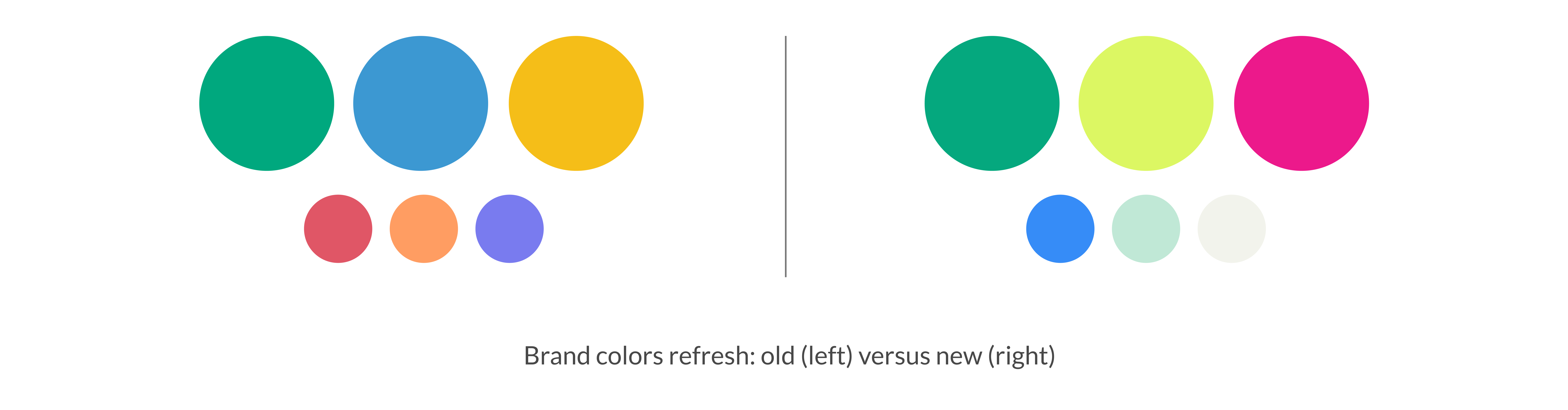
In recent months (with years in the making), OfferUp has undergone a branding revamp. We've refreshed our color palette, modernized our typography, and sharpened how we express our core values. But what inspired me most was how a simple, personal illustration style could become one of the most powerful tools we have to strengthen our connection with our users.
Illustration at OfferUp has evolved from a supporting visual element to a vital expression of who we are—and who we serve. In a marketplace where strangers connect to buy and sell with each other, trust is everything, and we knew our visuals needed to reflect that. Our new illustration style is more than just a visual update. It’s a statement about our values, and it represents a shift toward greater vulnerability, authenticity, and warmth.
Why We Reimagined Our Illustration Style
Like many growing companies, OfferUp’s visual language needed to evolve to catch up with the progress of our product and its value. We've been expanding beyond our resale roots to offer our community of users something they can't find anywhere else: a single platform to access more of the resources they want and need locally, including new and secondhand items, jobs, services, advice, housing, coupons, and events. In the last 18 months, OfferUp has transformed into a place that powers more of local life—and our brand needed to reflect that purpose.
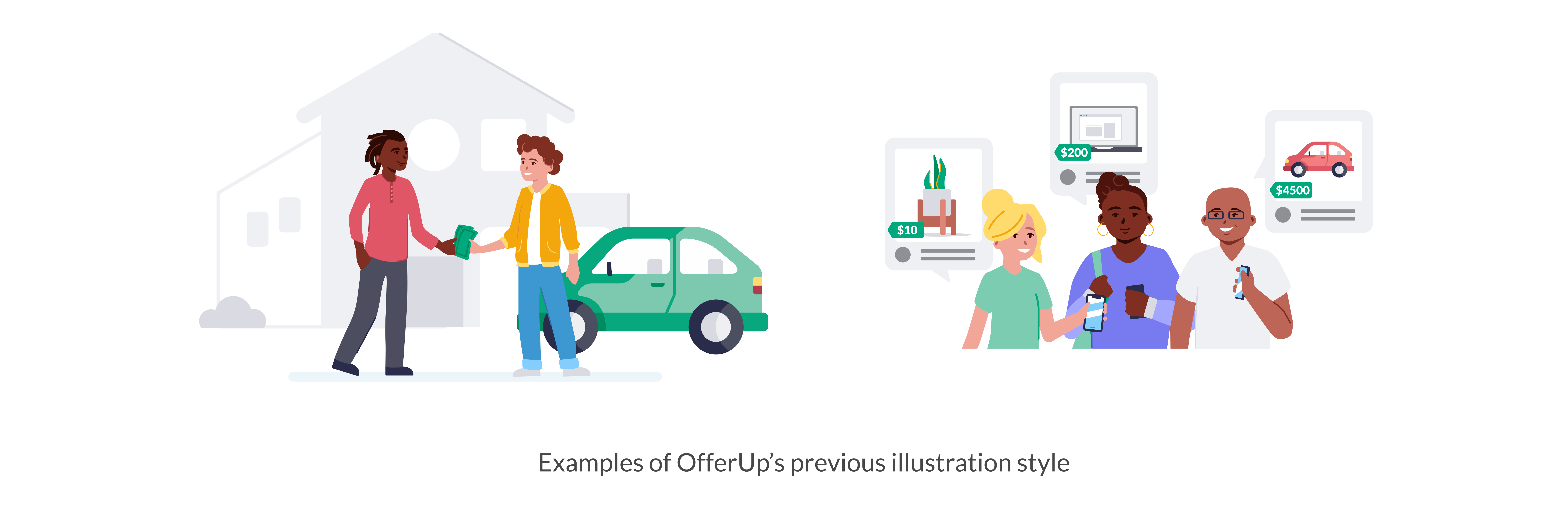
We realized our illustrations, in particular, weren't living up to the promise of the new OfferUp. In testing, they didn’t resonate. They didn’t inspire action. They felt static. And most importantly, they no longer felt like us.
We asked ourselves: what's the purpose of illustration? For OfferUp, it had to do more than add visual appeal. Our illustrations needed to build trust and provide clarity where words alone weren’t enough. They had to reflect our brand’s spirit: dynamic, genuine, joyful, and full of purpose.
The Process: Sketching Toward Something New
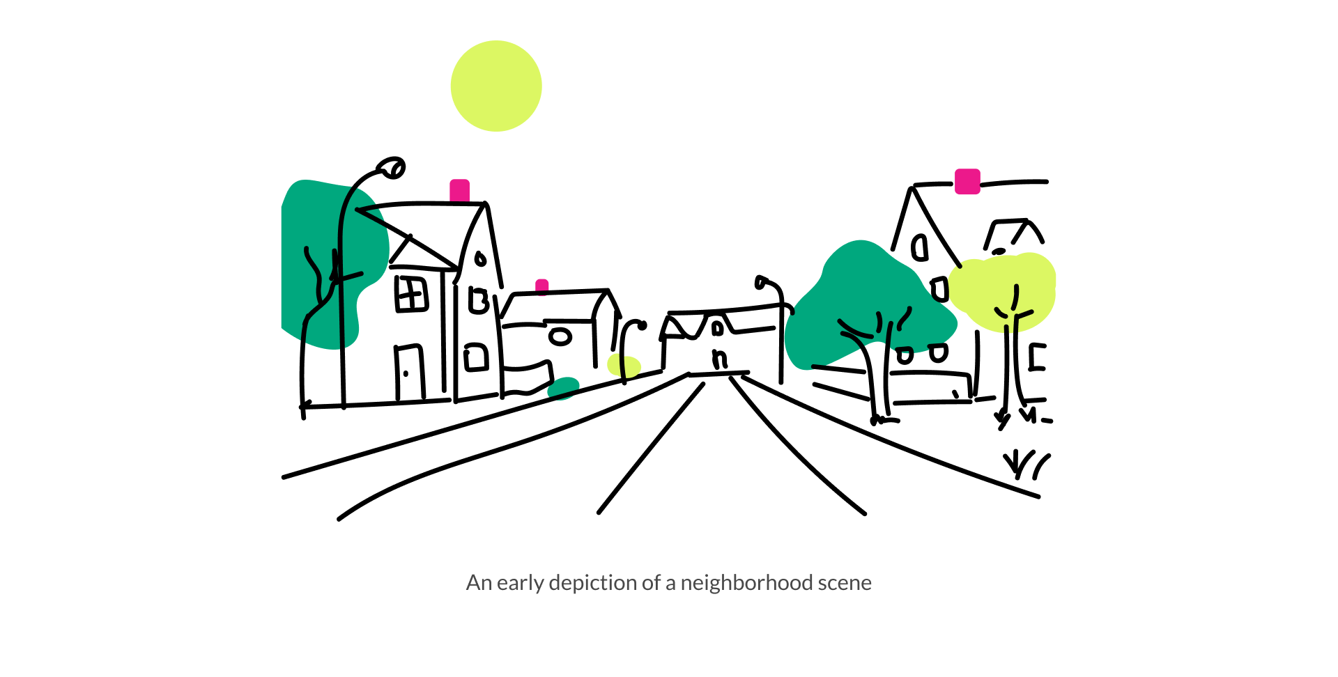
My journey as our lead illustrator began: I researched trends, studied competitor ecosystems, and examined how other brands used illustration to build emotional connection.
What emerged was a style built on free-hand drawing. Imperfect. Expressive. Honest. It broke away from the polished, corporate vectors that dominate so much of tech design today. We chose warmth over precision. Humanity over perfection.
The Style: Lines That Speak Louder Than Words
The new OfferUp illustration style is intentionally minimal, relying on line work and pops of color from our refreshed palette. Every drawing is created by hand. These lines aren’t just strokes—they’re gestures. Each one carries the dynamism of a real person on the other end.
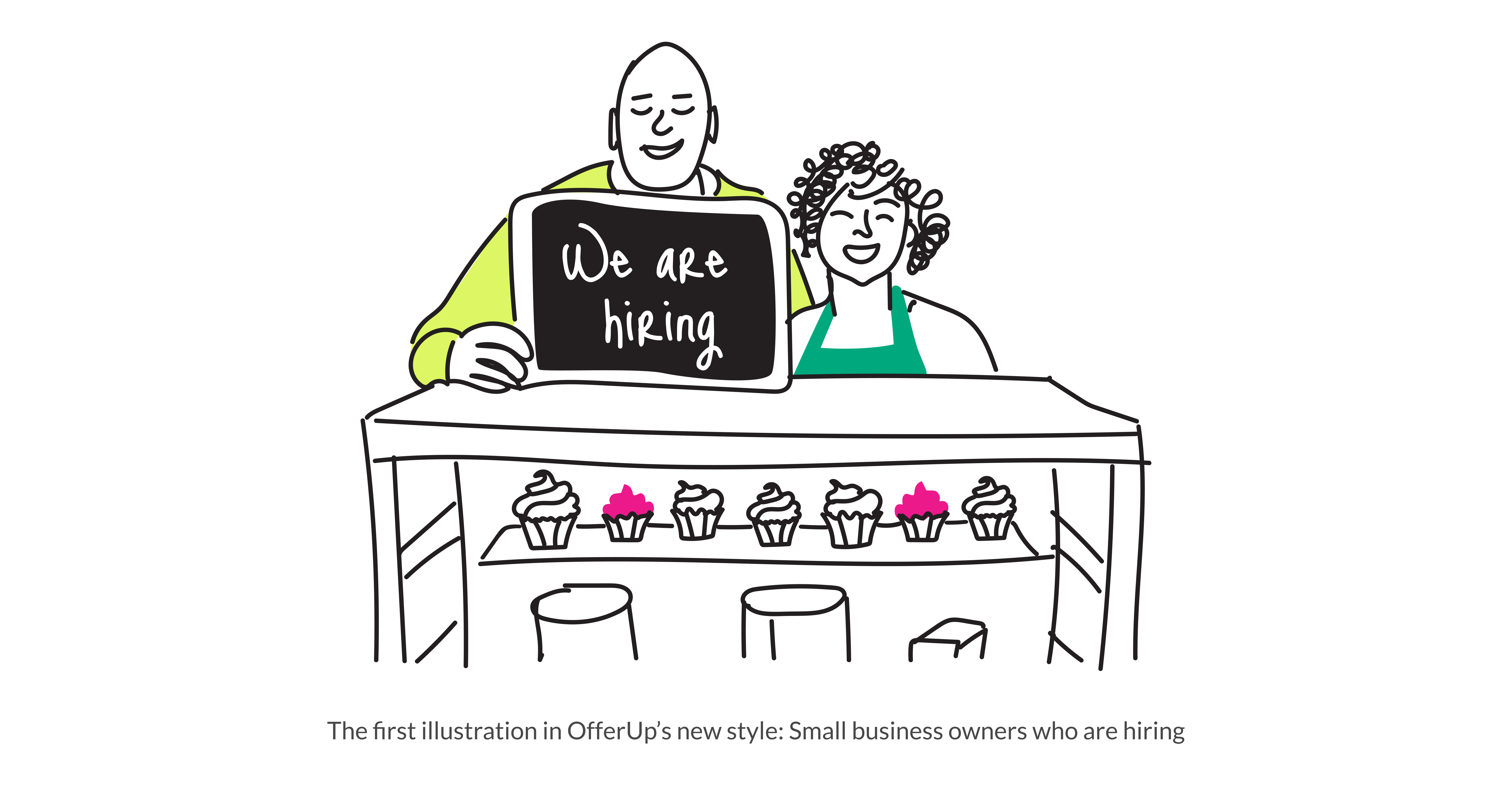
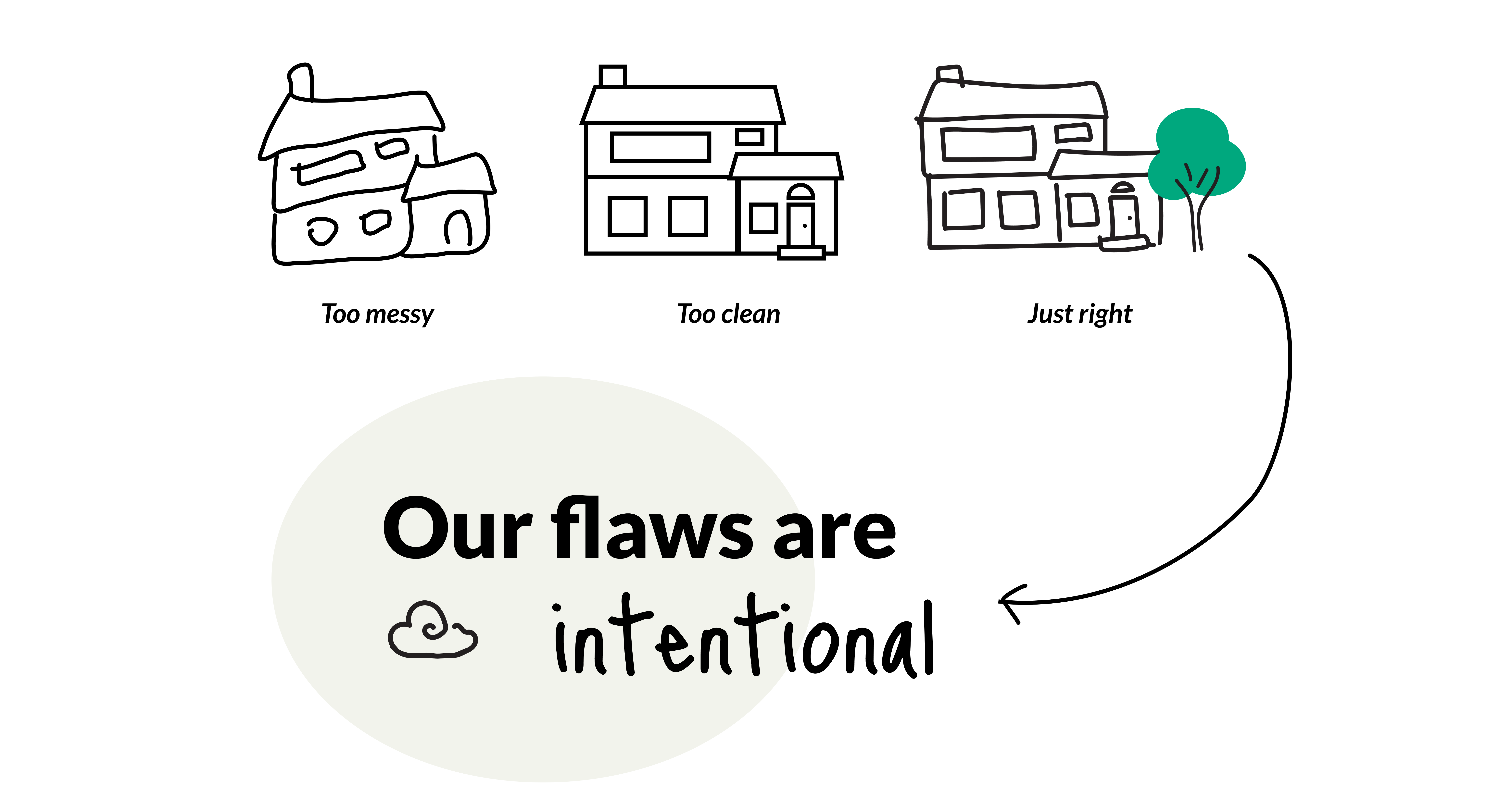
You’ll notice scenes that are open and bright but also grounded in everyday experiences. We’ve avoided abstraction in favor of clarity and prioritized a hand-drawn style that exudes the attributes people want in their own interpersonal relationships: vulnerability, honesty, and confidence that embraces imperfection. When I illustrate, I’m careful not to get too messy, which would connote a lack of intention and care; but I also stay away from the inauthenticity of perfect lines and hard edges. We want to strike a balance that's immediately relatable and welcoming.
Bringing It to Life
We’re still learning where illustration can make the biggest impact. And we’re testing everything—from emotional resonance to click-through rates. But early indicators are promising: our visuals feel more connected to who we are.
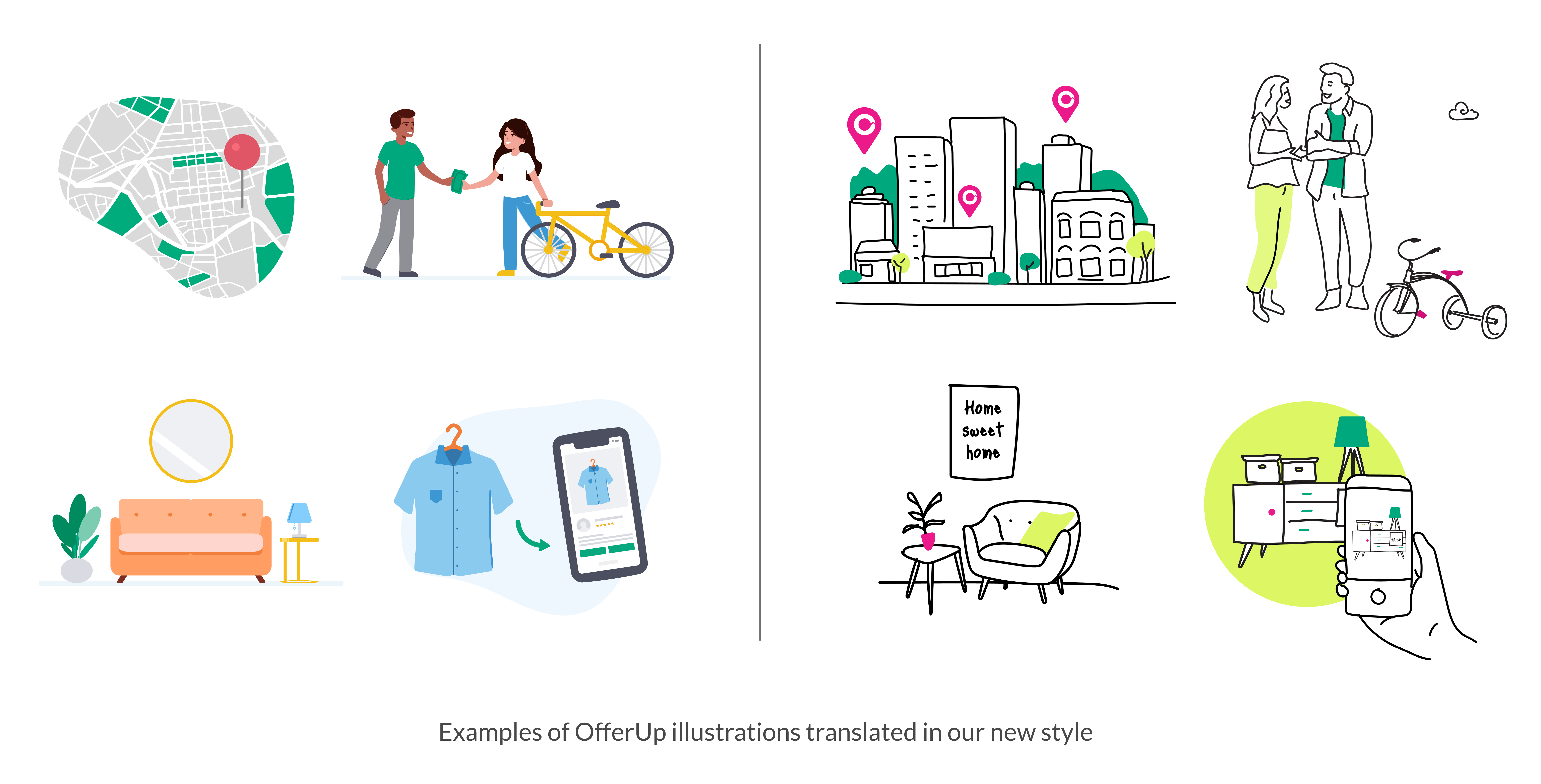
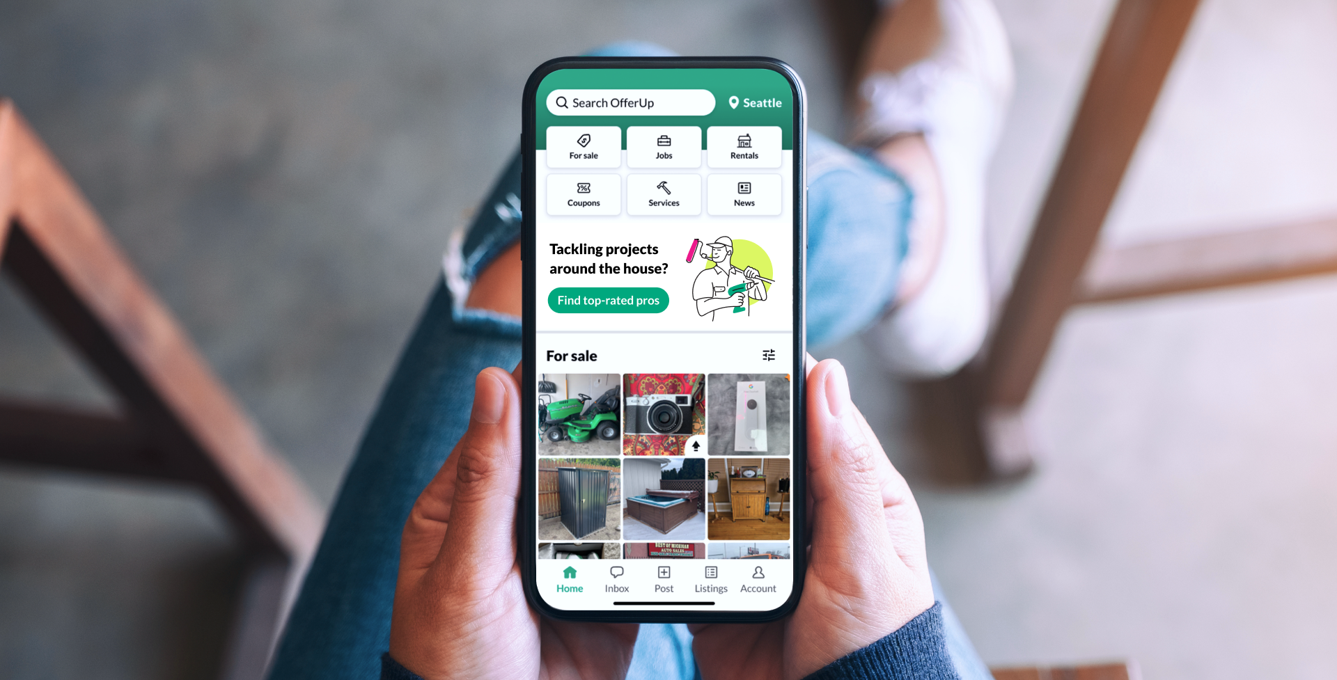
Today, you’ll find our new illustrations thoughtfully applied across our product and brand ecosystem, from onboarding screens and landing pages to blog articles and marketing campaigns. They help guide, educate, and comfort. Sometimes, they even surprise and delight.
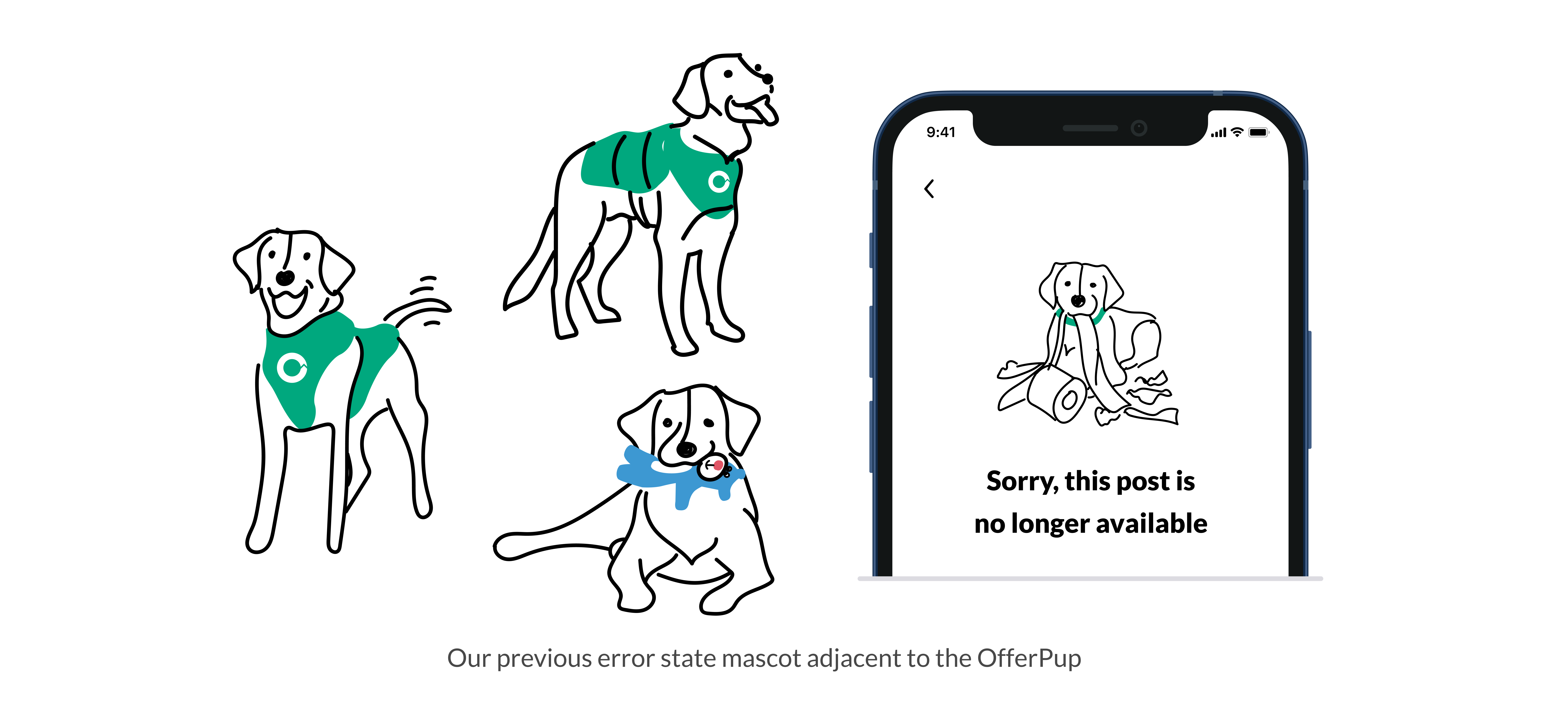
Moments of Delight: Introducing the OfferPup
In line with our intent to build a more neighborly and human brand, we’ve introduced a new illustrated character: OfferPup. This friendly yellow lab appears in moments where users might otherwise feel frustrated—like empty states or broken pages. Instead of a cold system message, OfferPup pops up to add a touch of warmth, relatability, and playful humility. She's there with a neighborly wink when it's needed most.
A Personal Note
As someone who has spent more than four years shaping OfferUp’s brand—and who poured countless hours into developing this illustration system—I can say this project has been one of the most creatively fulfilling of my career.
Putting my own drawing style at the heart of a brand used by millions was an inherently vulnerable act. But it was also empowering. It’s a reminder that design isn’t just about polish or perfection. It’s about people, and helping people connect.
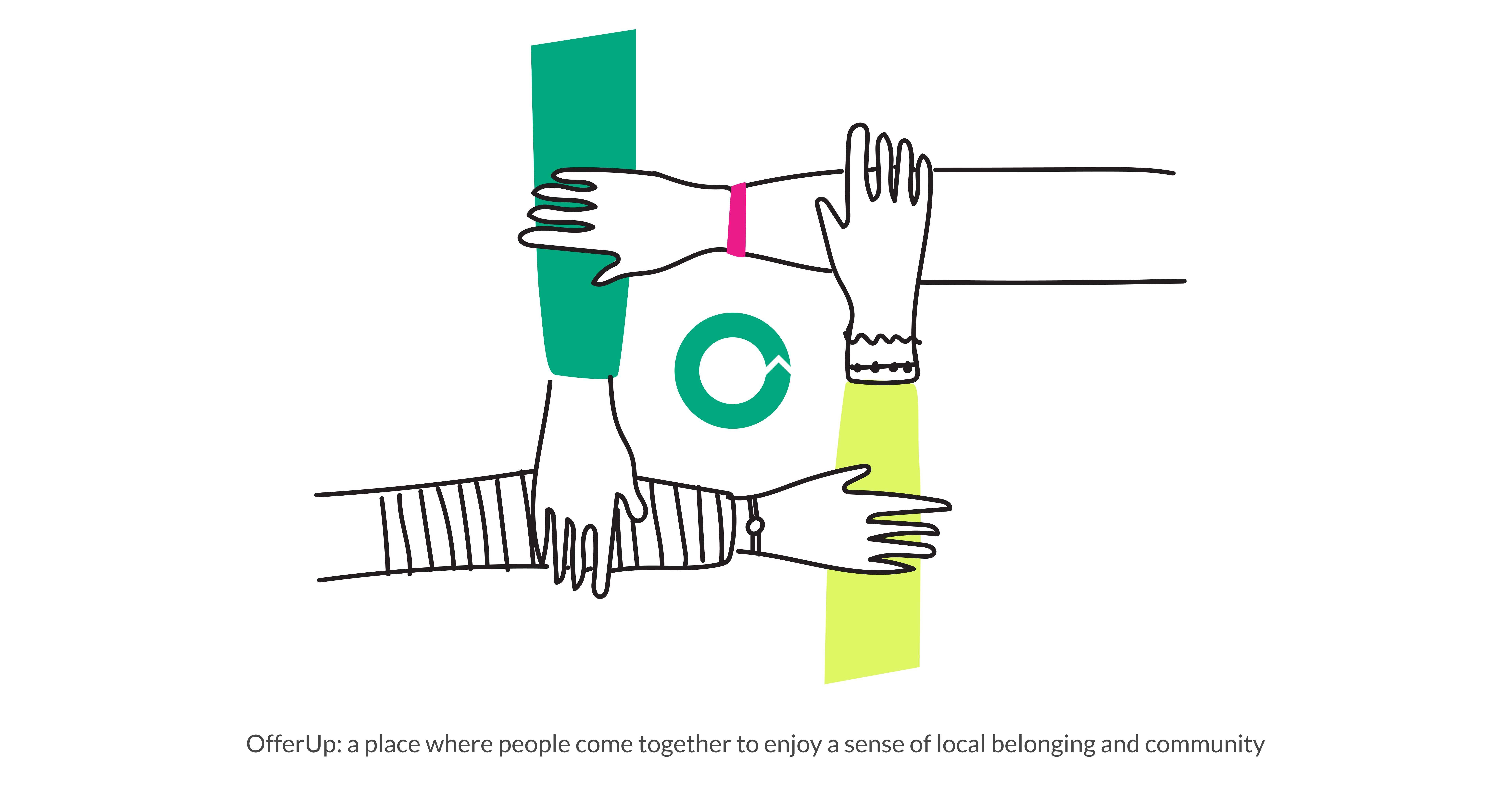
Illustration is now one of the most powerful tools we have to tell our story. Every line we draw is rooted in intention and reflects the warmth and trust we hope to earn from every member of the OfferUp community.
In a world that often feels automated and distant, maybe what we need most are more human marks. More hand-drawn gestures. More signs that someone, somewhere, cared enough to make it personal.